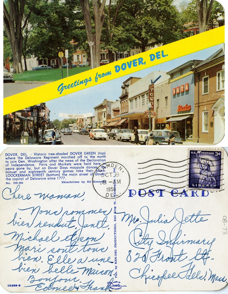
While linen cards continued to be produced into the 1940s, modern photochrom postcards began appearing in 1939. These postcards made use of Kodak’s newly refined color film, eliminating the need for color retouching by hand. The new, natural color “photochrom cards” monopolized postcard production by the mid-1950s. Also during this time, postcard production became dominated by multinational corporations, leading to larger numbers of more generic cards, rather than the small town scenes that local publishers had produced for decades.
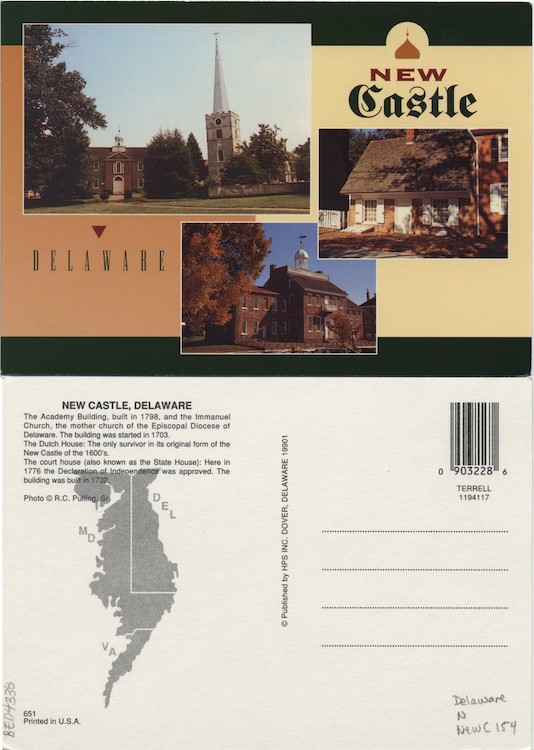
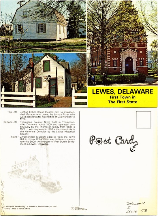
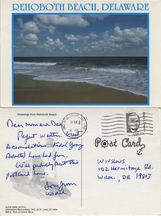
These postcards both display images by local photographers, providing viewers with information about three buildings in New Castle (left) and three in Lewes (right). The images in the postcard on the left were photographed by Richard C. Pulling of Dover, Delaware, who also operated Heitz Photoptic Service, a wholesale souvenir and postcard business. Kevin N. Moore photographed the images for the postcard on the right, as well as several others on this page. The publisher for this postcard, Marketplace Merchandising, also published books of Moore's photographs, including The Delaware Seashore (2003) and Lewes, Delaware: Celebrating 375 Years of History (2006).
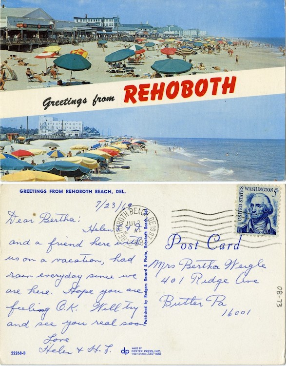
As the century progressed, postcard images often became less specific. Whereas the postcard on the left includes images of people and buildings that help to situate it within a specific time and place, the image on the postcard on the right is devoid of any time or place markers.
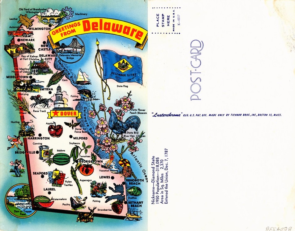
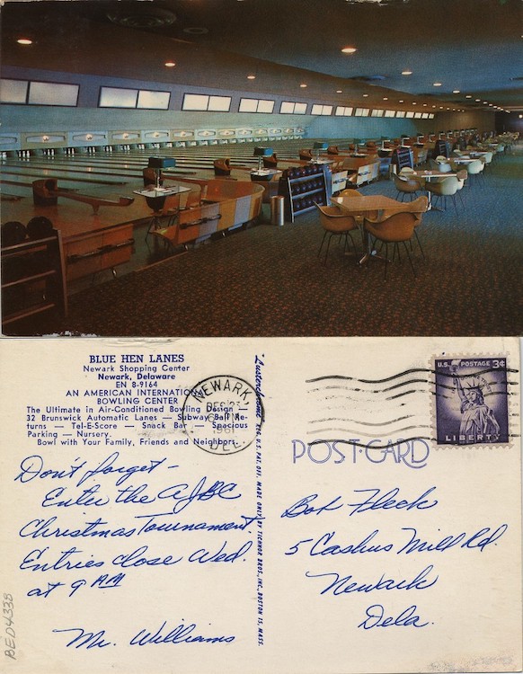
These postcards, both published by Tichnor Brothers, Inc., exemplify the difference between local advertising postcards and more generic postcards. The postcard on the left is one of several postcards showing illustrated maps of the entire state of Delaware, which could have been sold in many more locations than the postcard of Newark Shopping Center's Blue Hen Lanes.
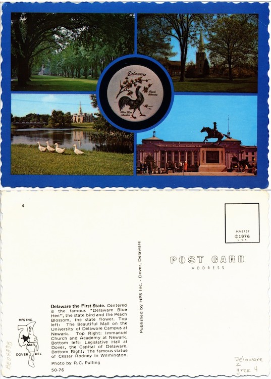
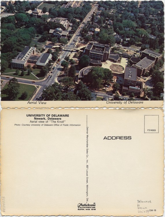
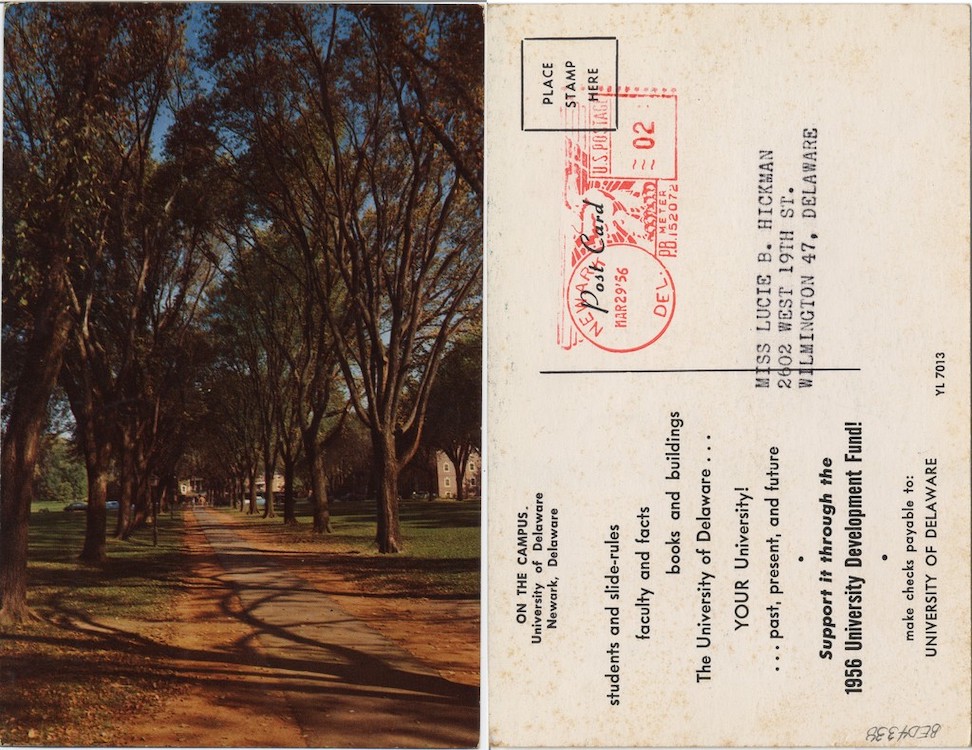
Both of these postcards appear to have a deckle edge, a term for the uneven edge that is often a feature of handmade paper. In this case, the edges of the paper were more likely cut to give the illusion of a deckle. Early postcard makers would use a false deckle to associate their postcards with fine art prints, and this type of edge regained popularity in the 1950s and 1960s as a decorative element.
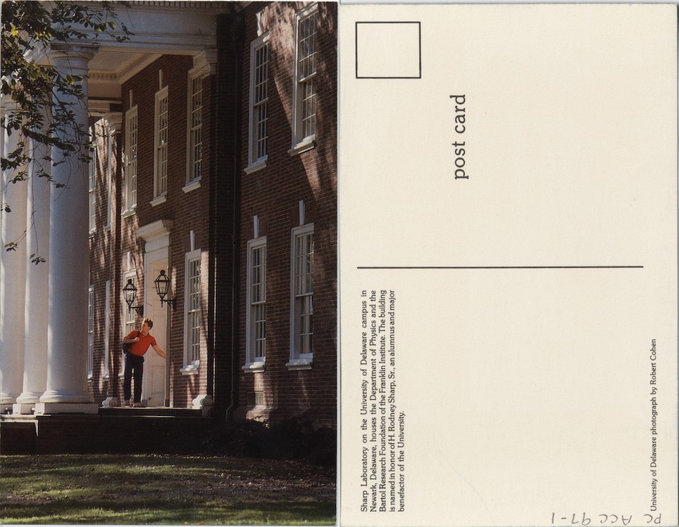
By this time, postcards were more often being used for direct mail marketing. The one on the left was published by the University of Delaware to garner support for its 1956 University Development Fund. The university also published a number of view postcards itself, including the one on the right, which displays an image by Public Relations Office photographer Robert Cohen.
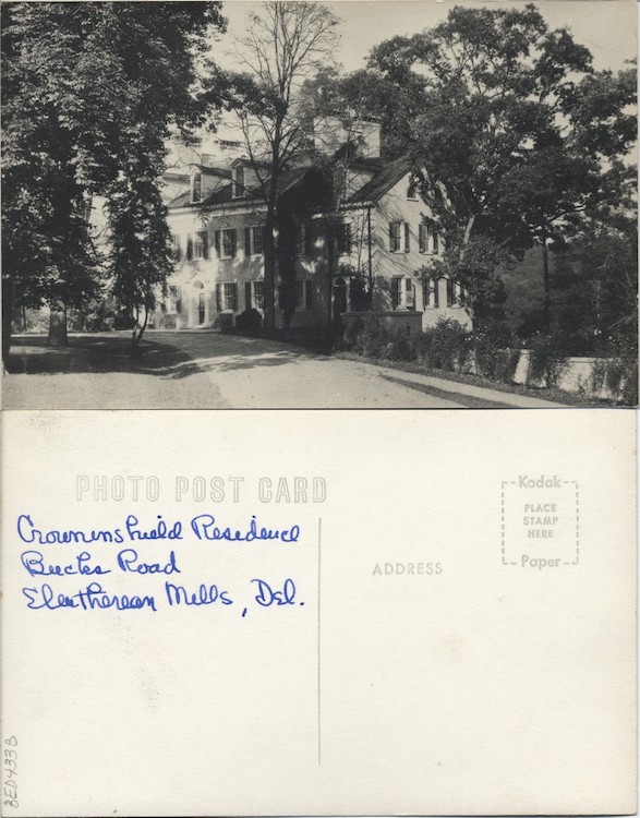
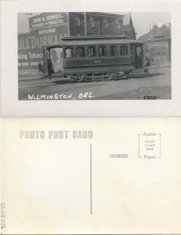
The Eastman Kodak Company has long been associated with real photo postcards, ever since it introduced a camera designed specifically to produce postcard-sized images in 1903. The company began selling silver chloride photo paper with pre-printed postcard backs a year earlier, and throughout the first half of the century, its photo postcard papers were marketed under different subsidiary company names, several of which appear on previous pages of this exhibition. This particular postcard back, with the heading "PHOTO POST CARD" and "Kodak Paper" written around the stamp box, did not appear until 1950, emphasizing the persistent interest in black and white real photo postcards.
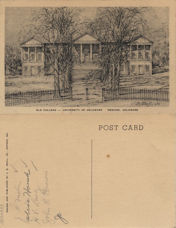
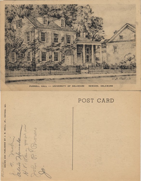
While photochrom postcards dominated this period, artistic postcards persisted. The two postcards seen here were created by John B. Moll, Jr. (1908–1991), an artist who was best known for his images of the Maryland Eastern Shore. Moll likely became aware of postcards as a potential format for his art while working for the Works Progress Administration in the 1930s and went on to sell tens of thousands of them. Today, Moll's art can be found at numerous art and historical institutions, including the National Gallery of Art, the Smithsonian Institution, and the Biggs Museum of Art.
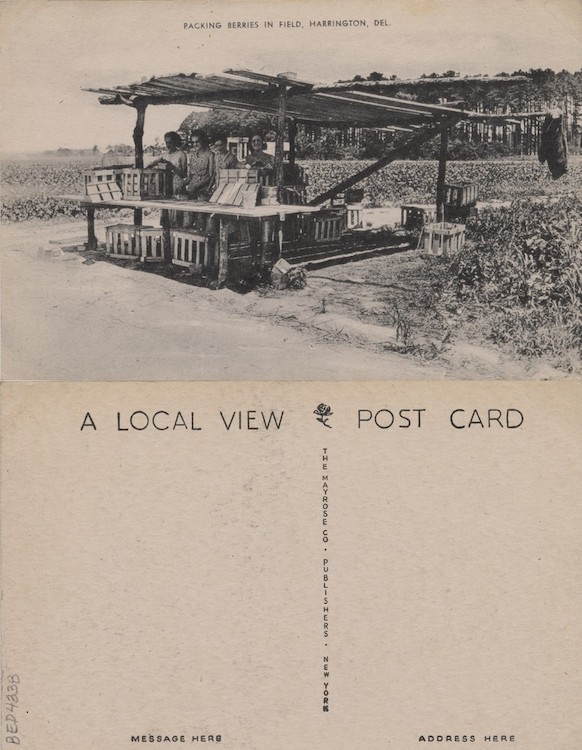
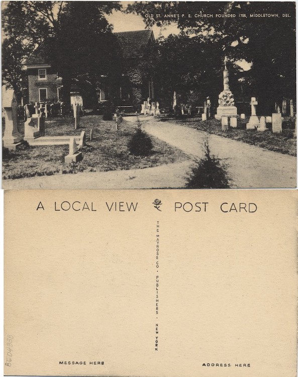
Despite the predominance of generic views and color imagery, Mayrose Co., a publisher out of Linden, New Jersey, produced a number of "Local View" postcards during this period. Most of these postcards were black and white collotypes and depicted scenes of New Jersey, especially modern highways and bridges. These views of Harrington and Middletown, DE are more reminiscent of the local views printed on postcards in the early years of the century.
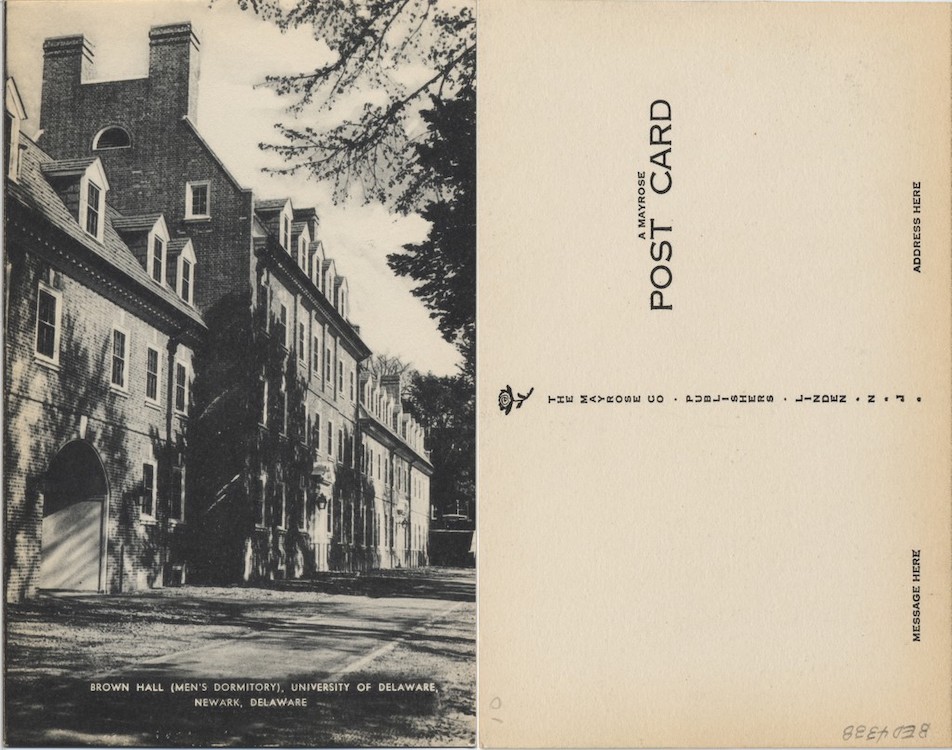
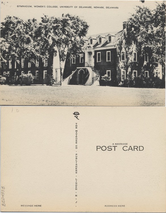
Mayrose Co. also published postcards with images of the University of Delaware, including the two seen here. At the time of these postcards' publication, the all-male Delaware College and the Women's College of Delaware had already merged to become the University of Delaware, but the university did not officially become coeducational until 1945.

