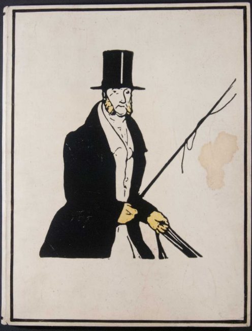
Verses paired illustrations by William Nicholson with short poems by Rudyard Kipling. While working, Nicholson showed Kipling woodcuts that he had made for a proposed calendar of sports. Kipling liked the illustrations so much that he offered to write verses to accompany them, and thus this book was born. Concurrent with the English publication, William Heinemann commissioned Will H. Bradley’s Wayside Press to print twenty copies in order to secure copyright in America. At the time, United States copyright law only applied to books printed in the United States. American publishers were legally able to publish their own editions of foreign publications without paying royalties to the works’ copyright holders. Many European publishers opted to print small numbers of pre-publication copies such as this to establish their intellectual property rights in America. Kipling, who was at the height of his popularity, had been an especially frequent target of American piracies, and, in turn, had grown diligent in asserting and policing his copyrights. It is not entirely clear why Bradley was selected to print Verses, and the edition that he published is unusual by the standards of copyright editions, which were most often cheaply made and created for the sole purpose of exploiting a legal loophole. Bradley’s edition of Verses, by contrast, is of very high quality, much more so than the regular edition that was printed in England. Bradley used handmade paper and hand-cut type, and he printed the book using black and red ink. Two copies of Bradley’s printing were deposited with the Library of Congress; the remaining eighteen were sent to Heinemann, who is believed to have given them away to friends, which may explain the unusually high quality of the printing.
The Bradley printing of Verses is one of the rarest of his works (as well as one of the rarest of all Kipling works), but the copy on display is especially unique even amongst other copies of this edition. Bradley was only commissioned to print the text, but, for this copy, someone opted to include hand-colored copies of the illustrations, which had been printed in England. These illustrations, though, are printed on sheets that are larger than those used in any of the English editions of the book. A copy of the prospectus for the English edition was also bound in. The binding on this copy, too, is unique. Bradley supplied his printing with a plain paper cover, but this copy was bound in a custom vellum binding, with a variation on the English edition’s cover design stamped onto the vellum. While the provenance of this copy is unclear, it was likely assembled in the publisher’s office using proof pages and other spare parts.
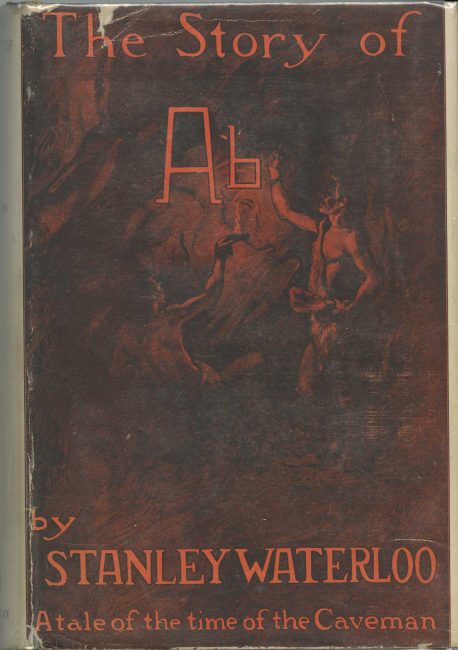
Stanley Waterloo was an American author and newspaperman. The Story of Ab, a novel set during the Stone Age, was his best known work at the time of his death. The novel was first published in 1897 and went through several editions in that year alone. Bradley designed the cover for this edition. According to Bradley, his intent in designing the binding was to create a design that would help draw immediate attention to the book and help make it stand out to potential customers.
For this reprint of The Story of Ab, the publisher used a simplified variant of Bradley’s original cover design. Doubleday, Doran & Company retained Bradley’s typeface but eliminated his illustrations, borders, and color scheme. The book was issued with an illustrated dust jacket (shown to the left of the book), then a fairly recent development in book publishing. This dust jacket provided the main decorative element, making an elaborate binding unnecessary.
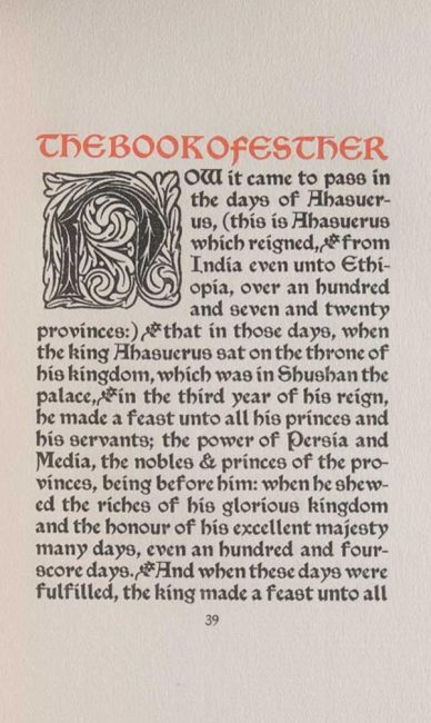
The Book of Ruth and the Book of Esther was originally intended to have been printed as two separate volumes. They were advertised in the January 1897 issues of Bradley: His Book, with an intended publication date of March 1897. The advertisement also stated that the two volumes would be the first of a series of books titled the “Little Classics of the Bible.” This project was interrupted when Bradley suffered a nervous and physical breakdown from overwork in February of 1897. After recovering, he focused on his book projects; this volume being one of them. The two volumes that Bradley had originally envisioned were printed and bound as one book, which was completed in December 1897. (There were no further installments in the series, either). The finished product was designed in its entirety by Bradley and was printed at his Wayside Press.
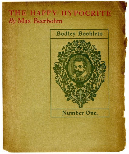
Max Beerbohm’s The Happy Hypocrite was printed for John Lane at Will Bradley’s Wayside Press, with a binding and printed ornaments designed by Bradley. The Happy Hypocrite had first appeared in The Yellow Book the previous year; this was the first time that the work had been published as a stand-alone title. This copy appears to have been a trial copy that was used as a printer’s proof. It was bound with three sets of wrappers, probably so as to test out several different cover designs. The detached cover, shown to the right, was the design used in the finished version. The other design was never used.
Beerbohm, Max, Sir, 1872-1956.
The Happy Hypocrite: A Fairy Tale for Tired Men. New York: John Lane, [1897].
Mark Samuels Lasner Collection
In 1929 Will Bradley inscribed this copy of The Happy Hypocrite with the note: “This is the first printing that I made of this book.” Bradley was incorrect, though; this copy is actually a second printing that was doctored to make it look like a genuine first printing. The subterfuge was accomplished by scratching out the text on the copyright page that would have identified this copy as a second printing. Evidently, even the book’s own printer was fooled.

